How to Use Responsive Web Design: Enhance User Experience
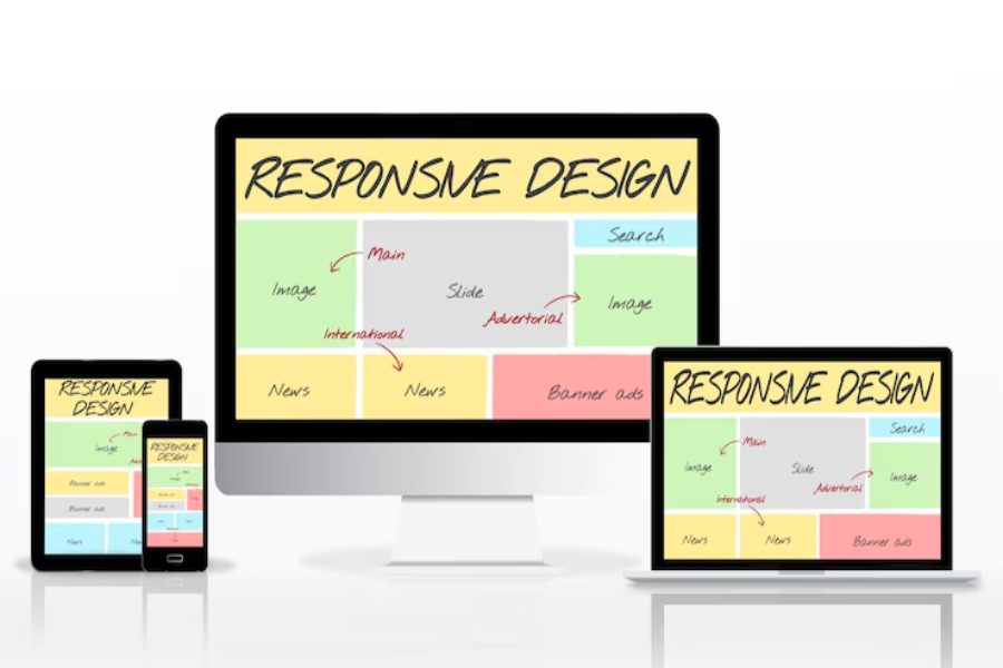
Ensuring your website looks great on every device is crucial in today’s digital world. Responsive web design is the technique that enables websites to adapt to various screen sizes and devices. Whether you’re designing a business site, blog, or e-commerce platform, mastering responsive web design ensures a seamless experience across desktops, tablets, and smartphones.
This approach uses flexible layouts, images, and CSS media queries that automatically adjust to the screen size, improving navigation and reducing bounce rates. By implementing responsive design, your website will not only look professional but also provide an optimized user experience. In this article, we’ll explore the essential elements of responsive design, along with best practices to help you create user-friendly websites. By the end, you’ll know to apply these techniques and elevate your web development skills.
Introduction to Responsive Web Design
Responsive web design ensures that your website provides an optimal user experience across all devices, from smartphones to desktops. To understand how to use responsive web design, it’s essential to grasp the core principles that make this approach effective. The main idea behind responsive design is that websites should adjust and scale content according to different screen sizes without compromising functionality. This involves using flexible layouts, media queries, and ensuring that images and content resize proportionally to fit various screen dimensions.
A well-designed responsive website maintains its visual appeal and usability, regardless of whether it’s viewed on a small mobile device or a large desktop monitor. The key technologies that power responsive web design are HTML, CSS, and JavaScript, which work together to create flexible, adaptable layouts. By implementing responsive design, websites can offer a seamless experience across all devices, boosting user engagement and improving SEO rankings. This approach ensures that websites are accessible and user-friendly, helping drive traffic and increase conversions.
Fundamental Principles of Responsive Web Design
Responsive web design is more than just adjusting content to fit smaller screens; it’s about making your website truly mobile-friendly. Achieving this requires a strategic approach to both the structure and style of your site.
Flexible Layouts with CSS Grids
CSS Grid Layout is a powerful tool that allows web designers to create flexible, two-dimensional layouts. These layouts automatically adjust based on the screen size, ensuring elements are aligned and spaced appropriately. CSS Grids offer greater control over design elements, making it easier to adapt content to different devices without losing consistency.
Fluid Images and Media Queries
Images play a significant role in responsive design. Setting the image width to 100% allows images to resize proportionally based on the screen size. This ensures images look good on both small and large screens. Media queries in CSS further enhance responsiveness by applying specific styles based on the width of the viewport, optimizing the layout for various screen sizes and devices.
Mobile-First Design Approach
A mobile-first design approach involves starting the design process for smaller screens and then progressively enhancing it for larger screens. This method prioritizes the essential content and features for mobile users first, ensuring that the site is functional and user-friendly on smartphones before scaling it up for tablets and desktops.
Benefits of Using Responsive Web Design
Responsive web design offers several advantages, especially in the context of user experience and SEO.
Responsive websites are easier to manage and maintain since there’s only one version of the site for all devices, reducing the need for multiple designs. They also tend to rank better on Google, as search engines prioritize mobile-friendly websites.
Key Benefits:
- Improved user experience across all devices.
- Reduced bounce rates by offering a consistent experience.
- Better SEO performance due to mobile-first indexing by search engines.
How to Implement Responsive Web Design?
Implementing responsive web design involves several key steps to ensure a seamless user experience across all screen sizes.
- Use Flexible Layouts and Grids: Create flexible layouts using relative units, such as percentages, instead of fixed pixel widths. This allows the design to expand or contract based on the screen size, making it adaptable across devices. Flexibility is key to a responsive design, ensuring that content scales appropriately.
- Leverage Media Queries: Media queries allow you to define different styles for different screen sizes. For example, you can set CSS rules for screens larger than 768px (tablets) or 1024px (desktops). This approach optimizes the design for various devices, providing a tailored user experience. Consider using Stylish Names for different sections to enhance the visual appeal and interactivity across devices.
- Optimize Content for Touch Devices: Ensure that buttons and links are large enough for touch navigation, especially on smartphones and tablets. Touch-friendly interactions, such as swipe gestures, enhance the user experience, making your site more accessible and functional on mobile devices.
Common Mistakes to Avoid in Responsive Web Design
When learning how to use responsive web design, it’s essential to avoid common mistakes that can negatively affect the user experience. Being mindful of these errors ensures your website functions seamlessly across all devices.
Overlooking Mobile Navigation
Mobile users need a simple, easy-to-navigate website. Overcomplicated menus, such as long drop-downs, can make navigation challenging on smaller screens. Instead, consider implementing a hamburger-style menu, which conserves space and allows users to access your site’s sections easily.
Using Fixed Layouts
Fixed-width layouts are not suitable for responsive design, as they don’t adjust well to smaller screens. Rather than using fixed pixel values, it’s better to use fluid grids and relative units, like percentages, so your content can resize and adapt properly across different devices.
Slow Page Load Times
A significant issue for responsive websites is slow loading times, especially on mobile devices. If your site isn’t optimized for speed, users may abandon it before it fully loads. To improve performance, compress images, and minify CSS and JavaScript files to ensure faster page load times and a better user experience.
Final Remarks
Mastering how to use responsive web design is crucial for web developers and designers in today’s mobile-first world. By utilizing flexible grids, media queries, and mobile-first strategies, you can create websites that provide a seamless and engaging experience across all devices.
Responsive design not only enhances user experience but also boosts SEO rankings and ensures your site looks professional on any screen size. Now that you’re familiar with the key principles and techniques, it’s time to apply them and start building mobile-friendly websites. Embrace responsive design to create websites that are accessible, user-centric, and adaptable to the needs of modern users.
FAQ’s
What is responsive web design?
Responsive web design is an approach that adjusts a website’s layout and content based on the screen size of the device, ensuring it looks good on all devices, from smartphones to desktops.
Why is responsive web design important?
It’s essential because more users access the web through mobile devices. Responsive design guarantees a consistent and smooth experience across all devices, increasing user engagement and satisfaction.
How do media queries work in responsive web design?
Media queries apply specific CSS styles depending on the viewport size, allowing different layouts and styles for various devices like desktops, tablets, and smartphones, enhancing the user experience.
Can I use responsive web design with existing websites?
Yes, you can integrate responsive web design into existing websites by adding CSS media queries and adjusting layouts, ensuring your site is mobile-friendly and adapts to different screen sizes.
Is responsive web design the same as mobile-first design?
Responsive web design adapts content to all screen sizes, while mobile-first design starts by designing for smaller screens and progressively scales up, focusing first on mobile users.

Charles Poole
Charles Poole is a versatile professional with extensive experience in digital solutions, helping businesses enhance their online presence. He combines his expertise in multiple areas to provide comprehensive and impactful strategies. Beyond his technical prowess, Charles is also a skilled writer, delivering insightful articles on diverse business topics. His commitment to excellence and client success makes him a trusted advisor for businesses aiming to thrive in the digital world.